Ohhh (swoon) I am IN LOVE with this light Sage Grey I am seeing everywhere this year! I could not find it… chalk paint so I had to create a custom mixed color. Who doesn’t love a beautiful neutral? Soft and sweet, this light sage grey is a perfect modern or traditional neutral color choice. Finding a neutral you love is key to helping tie together all your décor as it flows from room to room.
This post I am going to show you how I custom mixed this color so that you an replicate it too! You can print the recipe card or watch the mixing video and fallow along. Also I am sharing with you where I have seen this color this year in retail stores at the end of this post! So hang in there and lets get this custom color mixed up! There are some Affiliate links included in this post.
This light Sage Grey is a perfect soft color to accent the whites and neutrals but subtle enough to be the grounding neutral in a bolder décor. It goes great with deep blues and even reds! It is a very versatile color to say the least.
Why should we use this Custom Mixed color for furniture or cabinets?
Because a great neutral, like this light sage grey, will grow with accent color changes as you change for the season or your taste changes over the years. Choosing something that can be used in more of a neutral range will help prolong the design life for that item you paint. Remember you don’t have to just use chalk or furniture paint on furniture you can use it on picture frames, planters, even walls (though that can get a little expensive verses wall paint).
Furniture is great in neutral color if you have a lot of that in your space… say a bedroom set or a coffee and end table set. If you have a stand alone piece like a buffet or a hall table you can go wild with a bold color to make an impact in that space or wall.
How have I used this Light Sage Grey custom chalk paint mix?
Falling head over heals for this color very early this year, I saw a bit of a hutch peeking into the corner of a décor photo I had saved on a Pinterest board. I KNEW I needed have this this soft and sweet neutral in my home. It is a greenish version of a French Blue and it is just the best neutral I have found.
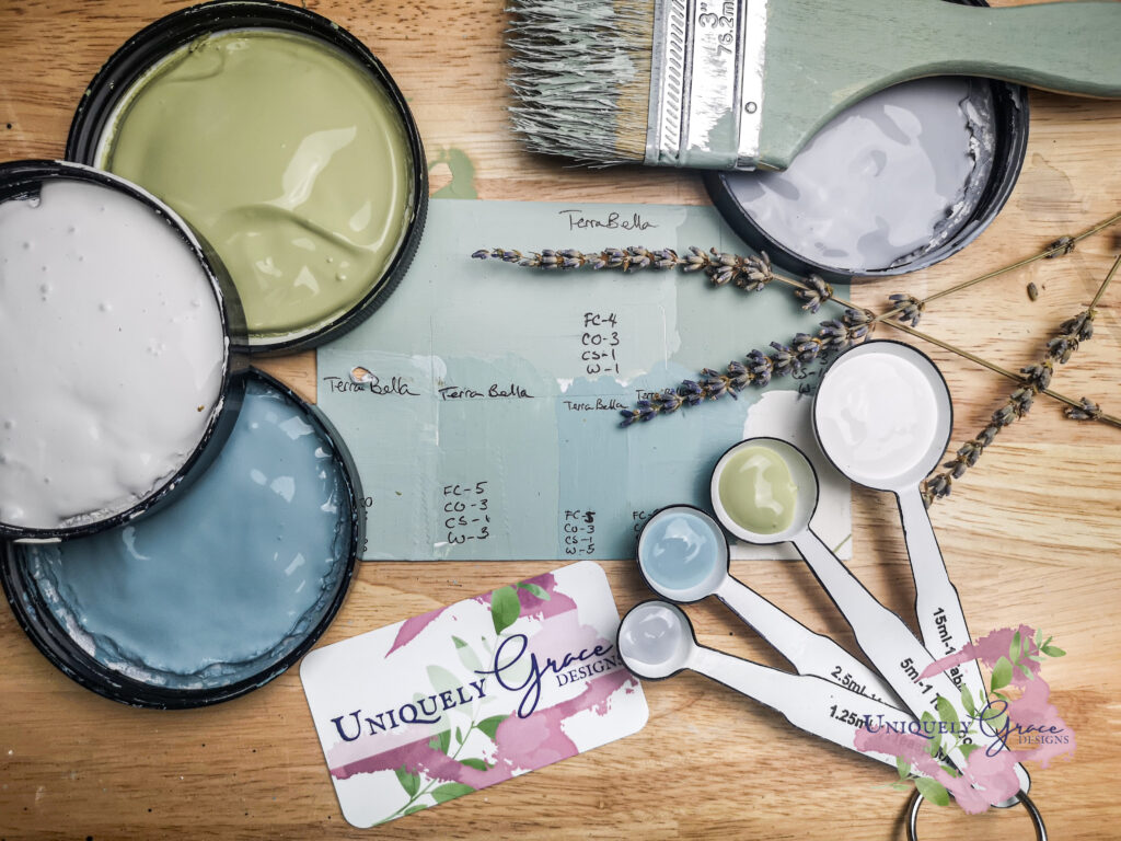
I began testing and recording recipe mixes for this color. You can see in the picture below all my sample mixes and how I arrived at the final one on the bottom left of the card. To record the different recipes as I mix the colors I write down color codes and the parts used to mix on each sample as they dry.
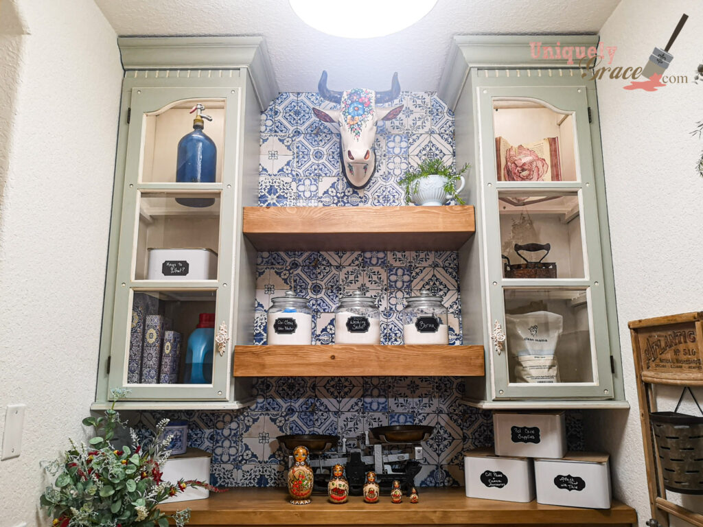
I was so in love with this light sage grey, I painted the cabinets in my laundry room this color. This custom mixed color is in my plan to paint something in each common room of my home to have this one color be the grounding color in my home design. I love how it makes me feel. Do you have a color you love? How does it make you feel?
How can the psychology of green impact the feel of a room?
The psychology of green is intriguing. It has a fantastically positive impact on how you feel in a room. Known for being a natural color it can evoke thoughts of growth, renewal and life. It can make you feel refreshed, full of abundance. Create a soothing atmosphere using softer variations of green to create a restful and room.
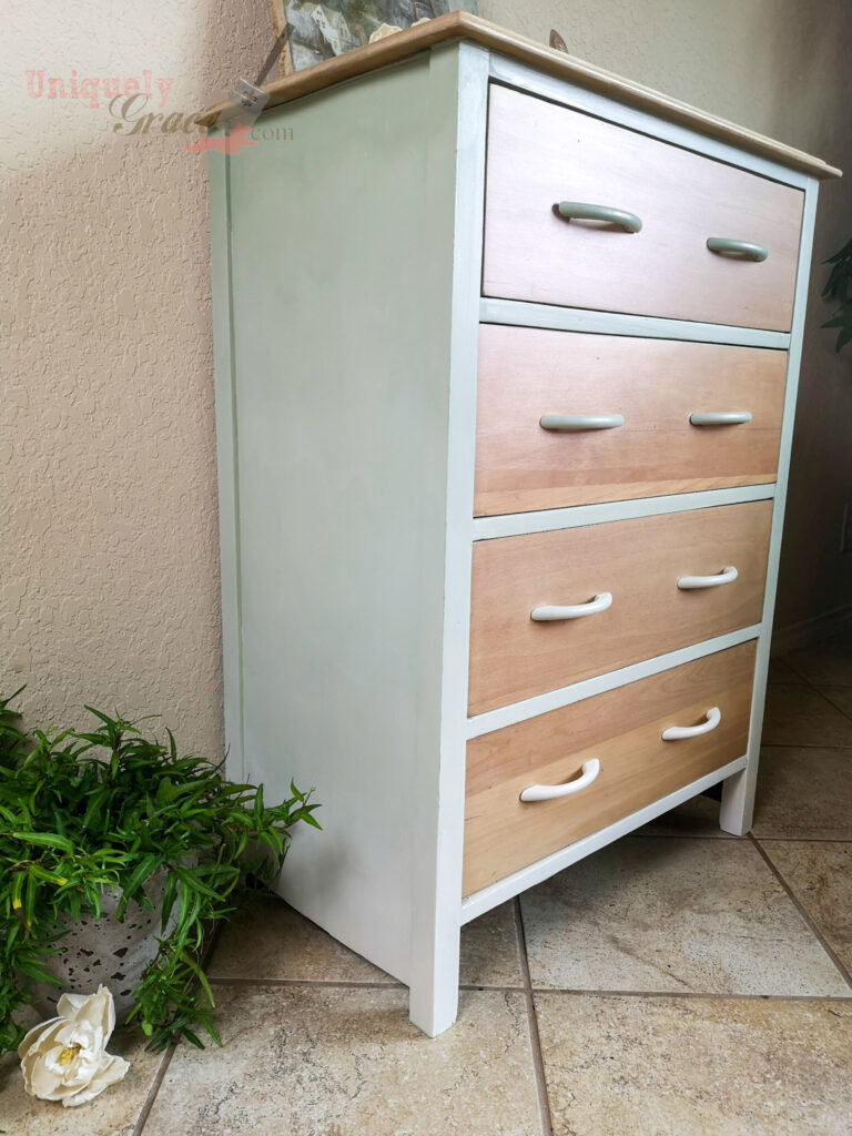
All of the above aspects of green make this light sage grey a wonderful choice for a bedroom or any room where you wish to relax and feel revitalized. I have demonstrated this using this sweet little dresser that would be prefect for a baby’s room or even a sweet teen’s room. The light sage grey used on this dresser fades nicely all the way to the bottom into the fresh cream color. I know these two color work well together because Fresh Cream is THE main paint color in the Light Sage Grey color recipe further down in this article.
Light Sage Grey in Interior Design – Who is talking about this Color this year?
Peeking around the internet this light sage grey and a bluer version, almost a French Country Blue…. are sweeping the décor sites with tons of lovely examples of soft subtly tinted greys. Here are a few of the sage grey posts. So don’t take my word for it. You will be seeing more of this color in the retail outlets soon.
In Décor Trends – Calls it “Quiet Dawn” (Tranquil Dawn)
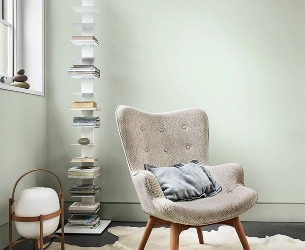
““Quiet Dawn” is a cold shade that includes gray, green and blue notes… AkzoNobel, which produces paints and coatings, as the main color in the interior of 2021. It will help to refresh the space, make it visually spacious . Since it belongs to the cold palette, do not forget to create contrast with furniture in warm colors. For example, Beige, Brown, and a shade of cappuccino blend well with Quiet Dawn.“
Valspar Paints – Garden Flower is one of their colors of the year 2021! Valspar is one of the leading wall paint companies in the US. Here is what they are saying about this color on their site…
“WHY IT’S TRENDING – This refreshing twist on sage green highlights our desire to restore the planet and our own mental health with minimalism and an optimistic outlook.
HOW TO STYLE – Transparent glass, crisp whites and light furnishings pair beautifully with the freshness of this gentle green hue.“
Modernly classic like the beauty of white roses, this natural tint is soft and simple, setting our mind at ease.
– Sue Kim, Valspar® Color Marketing Manager
My Décor Trends – states that …
“Sage green is yet another serene color that stands among the top interior color trends of 2021… (and)… In fact, due to its growing demand, sage green is now one of the trending bedroom colors for 2021.”
This custom mixed color of a Light Sage Grey chalk paint was created with this recipe:
Light Sage Grey Chalk Paint Color Recipe
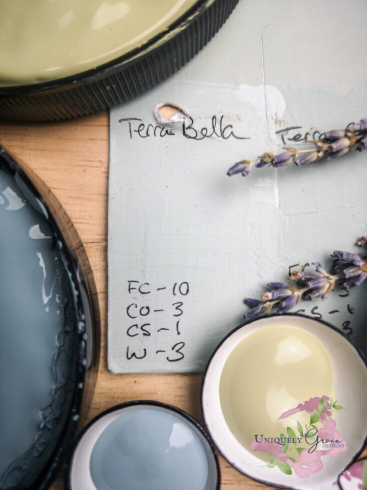
Color mixing this Light Sage Grey can be easier than you think. I have found a few shades of this grey premade but it is not a common color to find. So here is how I custom mixed my own to create this soft and sweet neutral. This finish is also antiqued with a Hazelnut glaze.
Originally created for a custom cabinet color in my laundry room I have also now used this on a dresser and plan to use this color on some walls in my home.
Tools
- Spoon
- Airtight Storage Container
Instructions
- In a container with a lid that is big enough for the final yield amount, add in 10 parts of Fresh Cream.
- Add in 1 part Cloudy Skies
- Add in 3 parts Waterfall
- Add in 3 parts Crushed Olive
- Mix completely into new color.
Notes
The amount of paint you yield in this color will determine on what size your parts are for the recipe. Calculate your surface area and add a 10%-20% buffer your square footage. Then determine how much paint you will need for that square footage by checking the Manufactures coverage rates. Divide this by the total amount of parts used for all colors in this recipe and you will have the size measurement of one part. Then follow the recipe.
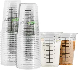
TIP: Using mixing cups with multiple measurements on it can be extremely helpful and keep cleanup to a minimum.
Recommended Products
As an Amazon Associate and member of other affiliate programs, I earn from qualifying purchases.
Where Can you shop for light sage grey décor?
Shop for Fall with me at Hobby Lobby!
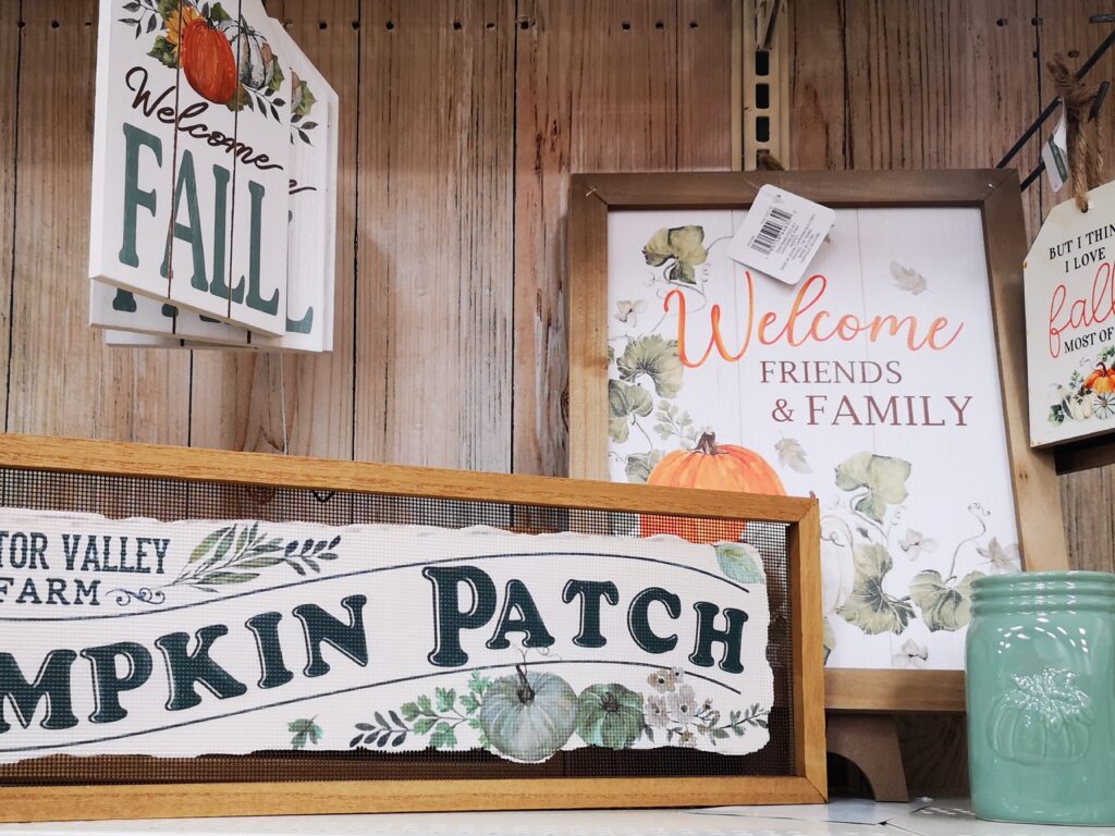
While shopping at Hobby Lobby this fall for some seasonal décor I found several items I am going to be using all year round because it is in my new favorite design color… Light Sage Grey.
This color is popping up in a lot of retail stores for this fall as a seasonal color. Here are some other places I have found it….
Michael’s:
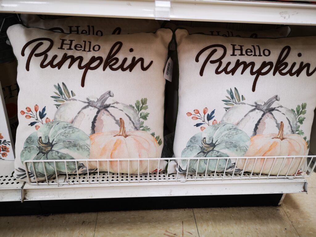
Though Michael’s Décor section is quite smaller than Hobby Lobby’s they still had a variety of items with the light sage grey. Items from Artwork, Vases, Pillows and pumpkins Which I purchased! LOL!
Kirkland’s:
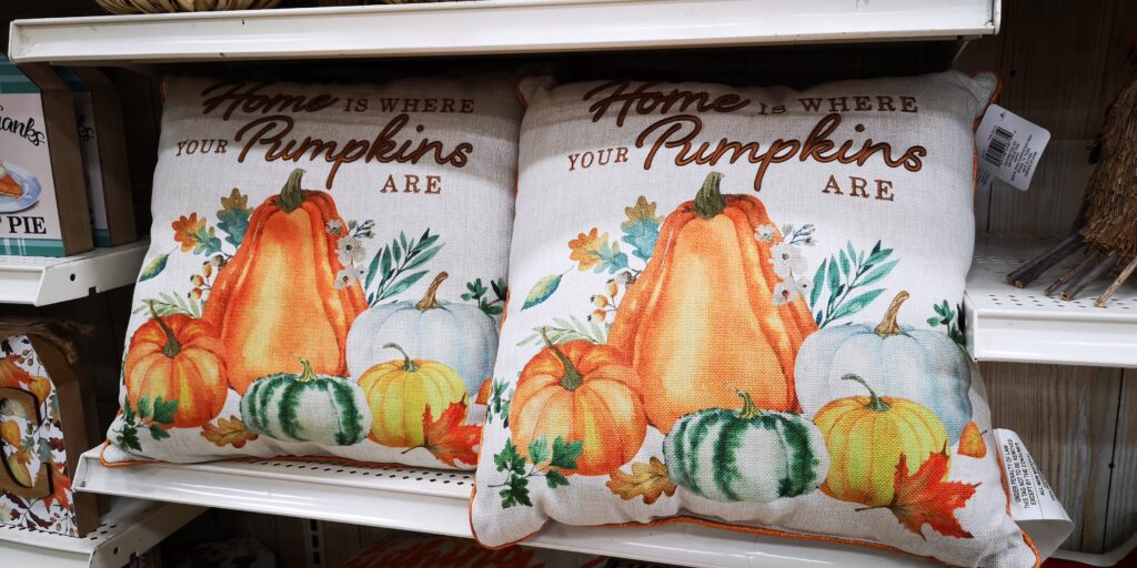
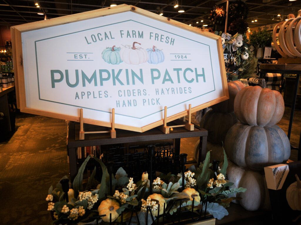
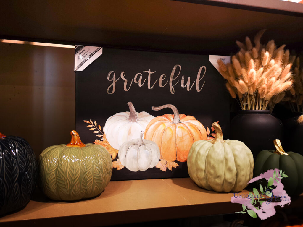
These three photos are just a sampling of what Kirkland’s had in stock. I absolutely love the pillow, because you know… fall really is my favorite! SO CUTE! The sign not only was a great shape but it was huge and the light sage grey and medium sage green pumpkins were just to adorable not to toss into an image. PS. Kirkland’s is a darker moodier store so the color shades seem darker than they are.
Thank you!
Thank you so much for sticking with me this far. I hope you enjoyed the videos and links for this custom mixed color – light sage grey please leave a comment below if you love this color. – OR – if you have a favorite color you have noticed is becoming popular in the home décor. You never know I may choose that color next to custom mix for my next furniture refinishing project.
Please take a look around! There maybe other posts you will relate too! Happy painting and all the best!
More Post that might interest you…
-
Vintage English Court Cupboard: ReLoveReStore in Pennsylvania $3,950
-
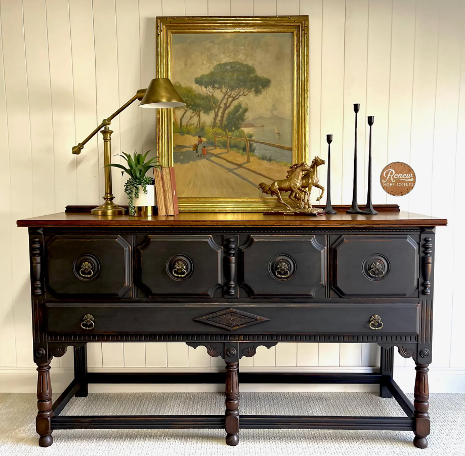
Antique Jacobean Sideboard – $3,325 in Starke, Florida
-
Unboxing 20 Zibra Paint Brushes – The Perfect Tools for DIY Furniture Refinishing!

